Page d'accueil › Forums › La critique › I want the Good, Bad and Ugly!! How's my drawing?
This topic contains 8 replies, has 5 voices, and was last updated by
![]() Martin Wittig
il y a 12 ans.
Martin Wittig
il y a 12 ans.
- S'abonner Favori
-
December 21, 2012 1:14am #24Just asking for a critique!! :)
The Violin Man is the most recent! And the images have been edited in photoshop so the lines show up because when I took the pictures they came out to light...so the lines have been darkened via Photoshop!!! :)
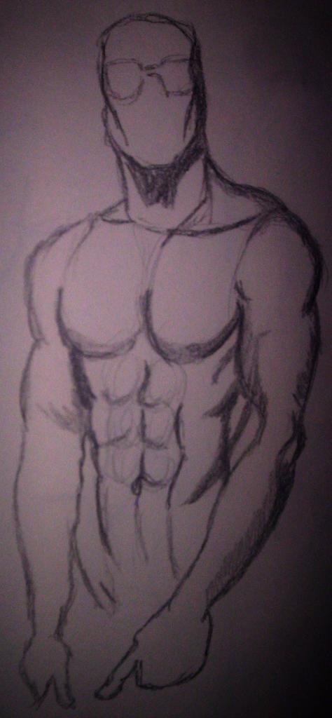
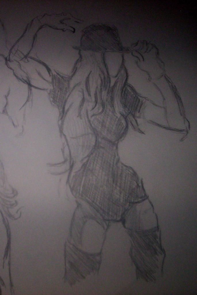
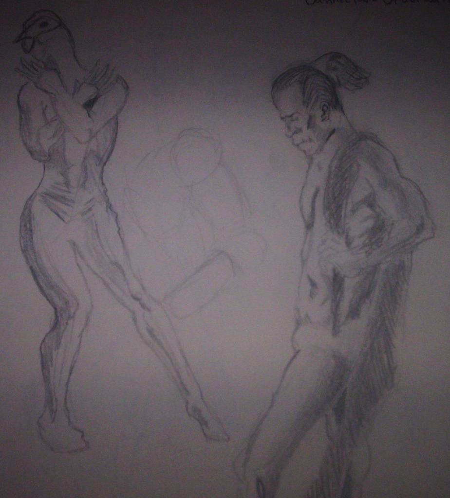
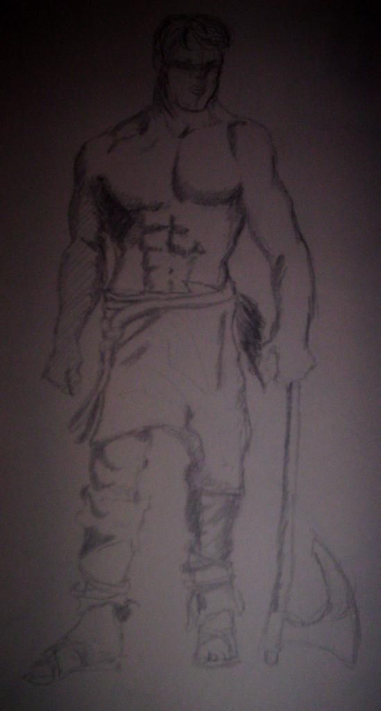
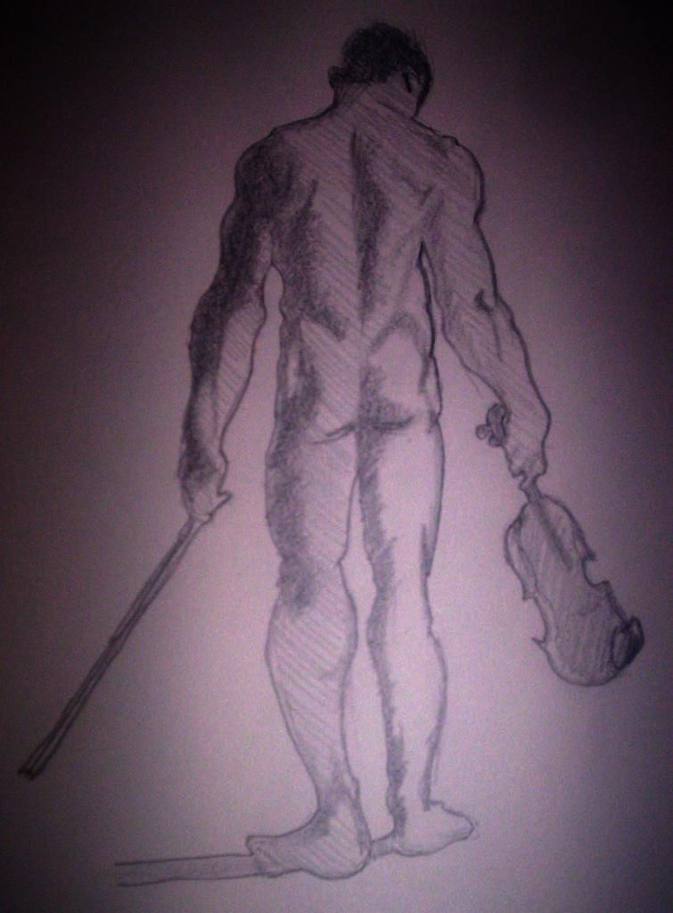
 January 4, 2013 3:35am #808The good - solid work, anatomy sizing feels pretty decent. Im assuming that these are from the photo references. Good work on the textures used. Decently defined hands (#2)
Areas you can improve
Try and draw towards the center of the page, so that the drawings are not cut off (ref 1, and 2) always keep that area around the drawing for expansion.
Go easy on the shading, keep it at a lower value as compared to the outlines. Shading helps define the shape of the muscle with the value of light.
Would like to see more faces
Ignore shadows (like the shadow of the feet in #4)
the more you practice, the lesser short strokes you'd use. This helps keep the outlines finer, cleaner and have a consistent thickness
Lucky-o-besto to you, Mondoman!1January 5, 2013 4:32am #811I must admit the arms on the lady in drawing #2 look quite manly. I would try and tone that down.
Also the proportions on the legs of the final drawing are a bit off on the legs, calves, and feet. Otherwise, your drawings give great basic shape.
I would most recommend working on proportions. Have you done any gesture drawing? That seems to be helping me.1January 6, 2013 9:37am #813Thankz for the advice....i actually have done a lot of gesture drawing but i never cared to learn proportions...ive always found that boring...even though I know I need to learn it! :(January 6, 2013 2:24pm #815Even though you find proportions "boring" if you intend to do art as a profession, or just some work for other people...they will probably not share your view when they see a portrait with mis-aligned eyes, or something non-visually appealing. Proportions make or break a drawing or painting...fact. So, if I were you, I would consider practicing them regardless of how you feel about them. They are foundational, just like practicing boring scales on a musical instrument. Still necessary.
Also, using a different line weight can add a lot of flair to an otherwise bland drawing.1January 19, 2013 7:51pm #821http://imageshack.us/photo/my-images/23/figuredrawing.jpg/
Hi. Here's my 2 cents worth. I think that you did a good job overall. For me, The most important aspect of any life drawing is Gesture First, then forms/ anatomy and lastly details. I believe that approaching any kind of drawing with that set of priorities will lead to greater success when drawing. Anatomy is important, but so is the gesture. Without that foundation, and without any feeling of life in the drawing, you are basically left with a stiff diagram of muscles etc. I did a sketch over yours, I hope that you don't mind, and while I didn't have the model to look at, I hinted at some landmarks and tilting of the shoulders to hips etc, that should be taken into consideration when your sketching. These are just my opinions of course, and it is based on my own education. I hope it helps?? Good luck!1January 19, 2013 9:06pm #822Thanks a lot for the advice!!...i like the drawing you did.. I've never had anyone do that...so it was interesting to see...some of these drawings were drawn using the figure drawing tool on this website a few others where just randomly found on a flicker app on my iPad!! :)
more specifically all the pictures except for the top 2 where drawn using the figure drawing tool!!January 19, 2013 9:58pm #823No Problem! I'm glad that it helped! Its great that you continue practicing! Good or bad drawings, it really doesn't matter as much as you keep at it. The worst thing you can do is feel defeated. Just keep pushing yourself!!!1
Login or create an account to participate on the forums.


