This topic contains 5 replies, has 2 voices, and was last updated by
![]() Nsto
5年前.
Nsto
5年前.
- 訂閱 喜歡
-
July 23, 2019 7:19am #4091
 July 23, 2019 7:21am #4092July 23, 2019 3:46pm #4094Main critique is you focus too much on the body for short poses. The limbs will tell you about the body. The point of short poses it to be able to go back later and get an idea of what the pose was. With most of these you have no idea when going back. It is a common mistake to focus too much on body and/or head.
My tricks, (Please do experiment. What works for me may not work for you so try things and see what works.) Gesture curve (Remember it should be a simple curve no complexity) to go through as much as the body and limbs as you can.
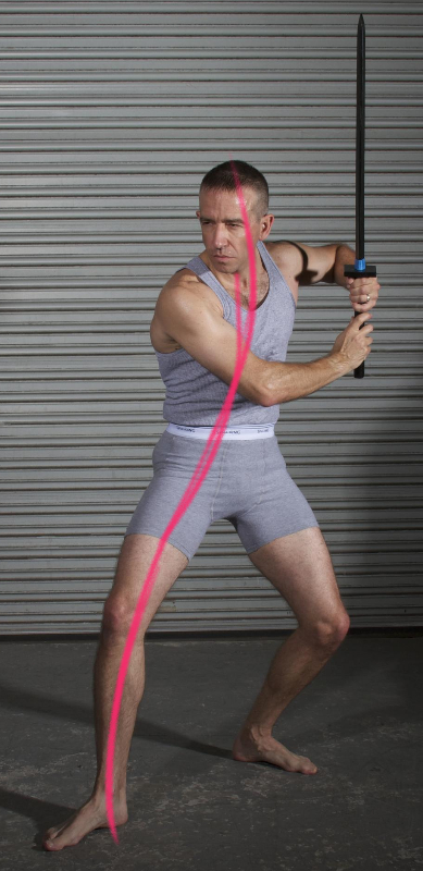
Then for body all you need is shoulder line, torso line, the curve side and pinch side. For very twisted poses a line in front and center back to show the planes of the body.
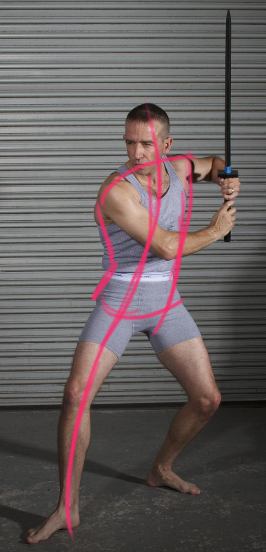
Then immediately get the arms either in a single line or I like to use triangles (I'll go over usefulness of such later.
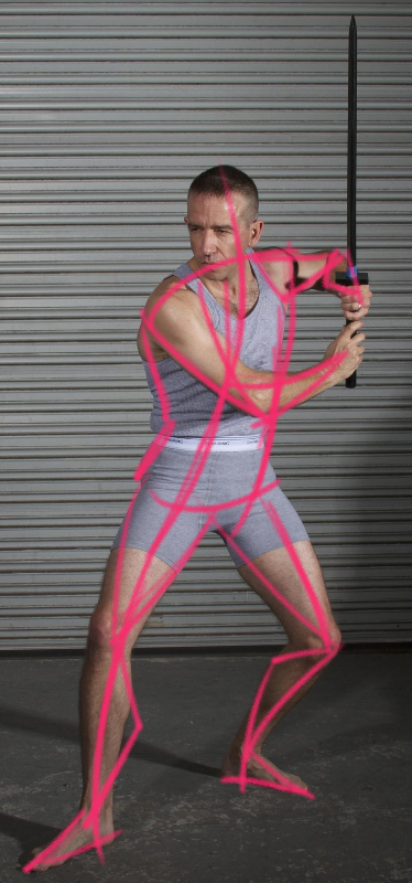
If you got time input head and hands. If there are objects they are working with draw the basic shape such as line, box, circle, triangle etc to represent it.
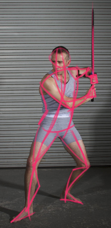
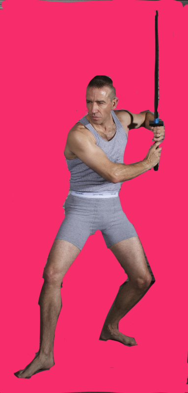
Now to explain triangles I have to first explain Positive and Negative space. If you don't know. Positive space is the subject matter, negative space is the background. This is a bit messy but gets the idea across. Pink is negative.
Now with this you can find useful shapes that make it easier to place limbs. I did as many possible triangles as an example, but really all you need is enough to get an idea for a limb placement. You don't need all of these.
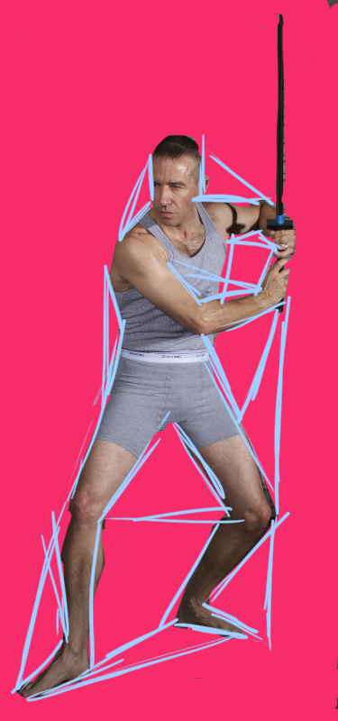
cc for image goes to SenshiStock3 1-
 Anne Hijme
edited this post on July 23, 2019 12:48pm.
Reason: fixing images
-
 Anne Hijme
edited this post on July 23, 2019 12:50pm.
Reason: fixing images
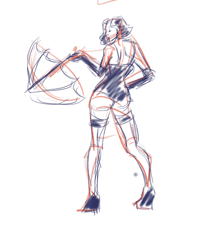
July 23, 2019 4:02pm #4096So you can see some of my gestures vs the explaining and tracing overlay. So you can see that they are still messy but enough info I got the idea later if I look what the pose was like.
Also I have to compliment you already figured out something that took me a while to do. With longer poses you began with gesture and then build on top of them. That took me a while to do. I had went straight into details, so great work on that.
NOTE: Even with these tips it takes practice to get used to it. My early gestures looked like yours except I focus more on the head. Like a lot.... So don't worry if yours do not look like mine even with these tips. I've had years of practice. It'll take some experimentation and practice to find the best techniques for yourself.
30sec
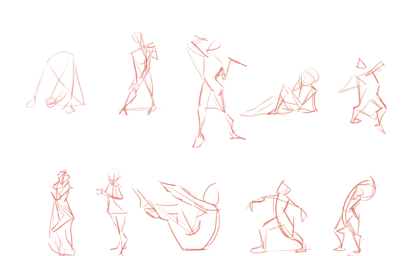
1minute
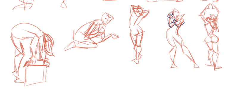
5min
 5
5-
 Anne Hijme
edited this post on July 23, 2019 1:04pm.
Reason: Adding a sentence
July 24, 2019 12:00am #4100thank you so much for the critique and for taking time to show me how to think, when it comes to short poses is hard to do the whole thing. thank you again I really appreciate it.1 -
Login or create an account to participate on the forums.


 [/url]